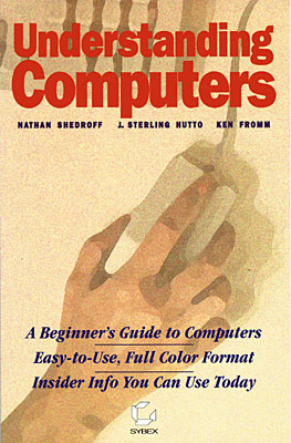
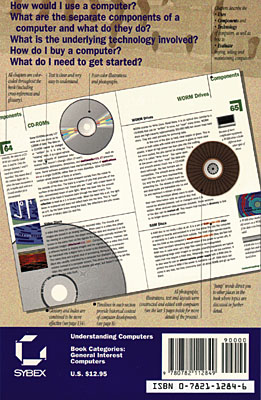
The book, Understanding Computers, was designed for my mother as well as all of those people who feel that they should know something about computers but don’t know where to start or are too intimidated. It’s design allows readers to follow their interests and have the sophistication of the information unfold as their interest does.
1992
Participants:
Nathan Shedroff: Writing, Design, Illustration, Production
J. Sterling Hutto: Writing
Ken Fromm: Writing
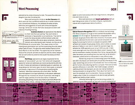
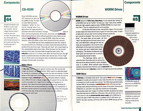
The design strategy for this book centered on creating an interesting reading experience that was neither intimidating nor uncomfortable. We deliberately designed the book to be small in both size and page count. We organized the topics and content around a descending amount of abstraction. Instead of starting with subjects like binary code and working up to more sophisticated topics, we reversed the flow and started with the applications of computers and what could be done with them. Next were the topics about the components and lastly, the technology.
This organization allows readers to find immediate relevance to issues they are most concerned with and increases the technical level of the materials as they read further into the book.
The layout is dense but easily navigated. The color-coding of the chapters is supported through the jump words, within the chapter page elements, in the table of contents, and in the combined glossary/index. The jump words point to editorial connections of related material. These connections serve as springboards to other sections of the book while the bold words act as landing sites on the page as well as general aids to skimming. The text is written clearly and “chunked” so that it can be scanned quickly and can stand alone without the need for elaboration.


Recent Comments