
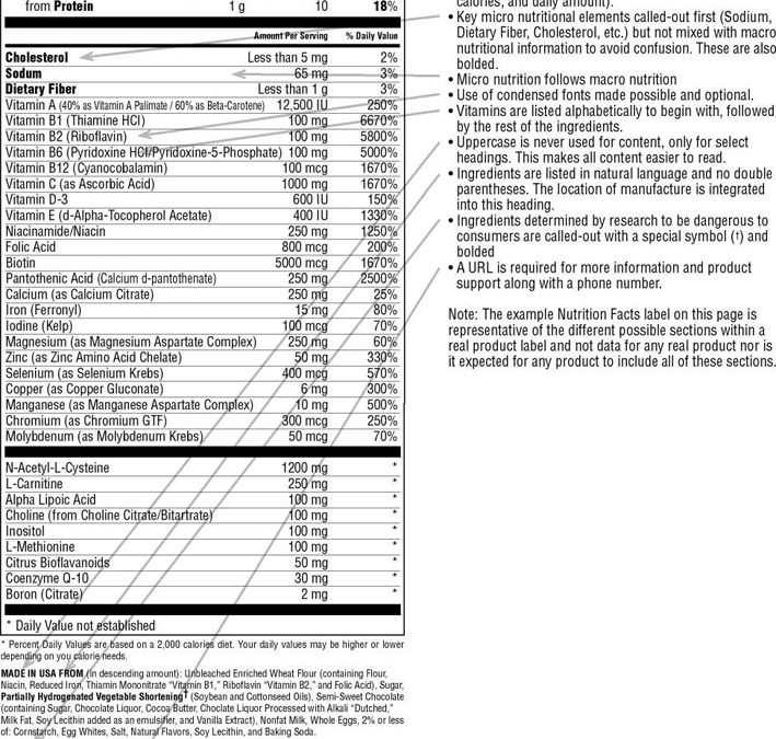
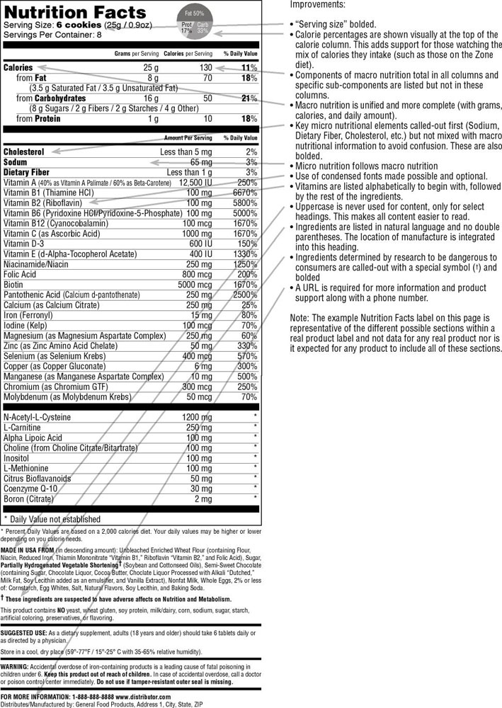
I have been very interested in label. One exploration was a series of small additions to the standard Nutrition Facts label that could make it function better for consumers. These include:
- “Serving size” is bolded.
- Calorie percentages are shown visually at the top of the calorie column. This adds support for those watching the mix of calories they intake (such as those on the Zone diet).
- Components of macro nutrition total in all columns and specific sub-components are listed but not in these columns.
- Macro nutrition is unified and more complete (with grams, calories, and daily amount).
- Key micro nutritional elements called-out first (Sodium, Dietary Fiber, Cholesterol, etc.) but not mixed with macro nutritional information to avoid confusion. These are also bolded.
- Micro nutrition follows macro nutrition
- Use of condensed fonts made possible and optional.
- Vitamins are listed alphabetically to begin with, followed by the rest of the ingredients.
- Uppercase is never used for content, only for select headings. This makes all content easier to read.
- Ingredients are listed in natural language and no double parentheses. The location of manufacture is integrated into this heading.
- Ingredients determined by research to be dangerous to consumers are called-out with a special symbol (Ý) and bolded
- A URL is required for more information and product support along with a phone number.
- Note: The example Nutrition Facts label on this page is representative of the different possible sections within a real product label and not data for any real product nor is it expected for any product to include all of these sections.
2002
Recent Comments