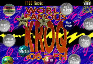
The problem to be solved here was to create a unique identity and organize the programming of online components for radio and television stations entering into online interactive media. While this particular radio station was chosen as a test case, the elements and structures are designed to be flexible enough for all types of broadcast-related materials to be integrated while changing the visual and aural design to respond to the character of any station. This is still a work in development in partnership with advanced enhancements to a current online service. It is sensitive because it reveals a bit of these partners” approaches and is the only piece in this portfolio that is confidential. Please respect the nature of this development by not describing it to others.
1994
Participants:
Nathan Shedroff: Information, Interaction, and Visual Design, Production
Sam McMillan: Project Management
David Karam: Visual Design
We organized the screens with a narrow but broad structure that clearly distinguished different areas but kept an exploratory feel to the interface. It was important to have the radio station’s call letters and frequency number visible in some way at all times.

The screen uses floating windows to clearly differentiate types of information. For example, all features that users can use to communicate, add information, or participate online are in floating windows while all navigation buttons merely change screens. This allows users to keep open processes or activities from several different places at once while keeping the number of windows open to a minimum.
Different types of buttons have different shapes and different highlights. The round tab buttons, for example, twist when users move the cursor over them, while the spheres warp. The round tab buttons always take users to a new screen or “place,” while the stars always open a calendar of some kind. This sepa-ration of buttons by function is a subtle reminder of the different buttons’ behavior that doesn’t get tiring or annoying with repeated use.
Both the colors and patterns are intentionally wild and busy. This was in response to this station’s image. Other stations could use the same online engine, but have completely different visual and audio com-ponents that are more appropriate for that station’s audience. However, the principles of behavior, organization, and interaction would be the consistent.


Recent Comments