
We used to speak a lot about “metaphors” in interaction design but as we’ve settled on so many archetypes, now, this seldom enters the conversation. We simply assume the dominant paradigm and dress it up differently—if at all. But, the reality of mental models and metaphors is that there are always many more opportunities than the ones we’re “used” to. It’s been years since the famous Apple v Microsoft “look and feel” trial, in which courts just decided that everything was obvious and there were no other alternatives. Similarly, at the beginning of the smartphone revolution, there could have been many options for what your phone screen looked like but we only got one (a copy of the iPhone) and there’s been no viable alternative since (other than dispensing with the screen altogether).
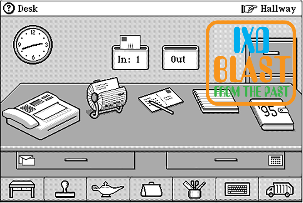
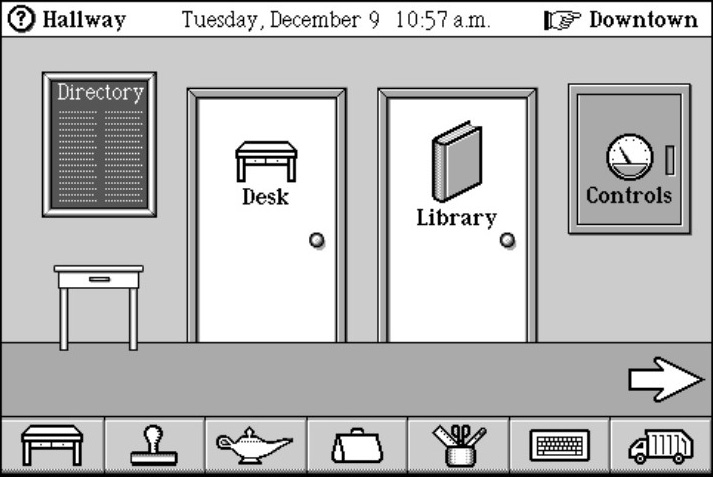
One of the first mobile devices with a unique interface, MagicCap was developed by General Magic in 1994 as one of the first PDAs (Persona Digital Assistants). In order to help familiarize users to such new and powerful features, the development team created a metaphor to contain most of its functions. This “room metaphor” organized all of the device’s features into distinct rooms, which users could move between. The start room, which the device defaulted to upon turning on, contained a large desk representing common work applications as iconic objects, such as a calendar, clock, phone, drawers, etc.

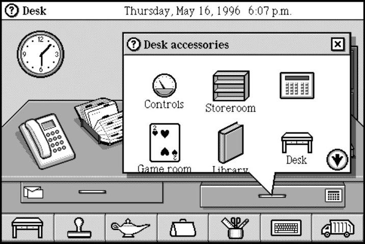
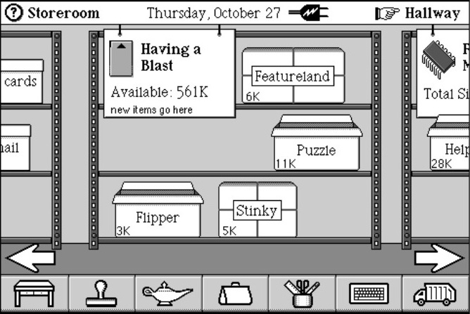
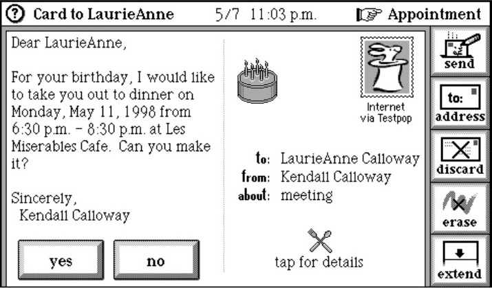
Outside of this room was a hallway which led to more rooms, such as a store room, game room, library, etc. Outside of the hallway was yet another organizing level, extending the metaphor, called “Downtown.” This was a “street” with buildings that represented different services, such as Internet connections, news, etc. In order to reduce the need to move between rooms, down the hallway or street, and other buildings, objects could be copied into places that automatically launched the services users expected in other places. While this cut down a bit on the need to “walk” down the street or hallway, it could never wholly replace the need to leave the main room (or desk).


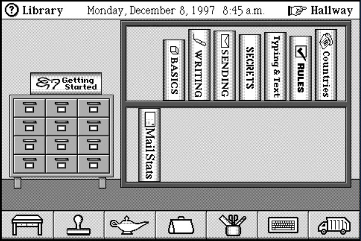

In order to hold true to the metaphor, most functions in the interface were represented metaphorically as common objects and rendered digitally to resemble these (now called skeuomorphism). Addresses looked like an address book, file folders had tabs, notebooks and spiral bindings, book corners could be folded over, etc. Like most metaphors, this helped users quickly become acquainted with the system but ultimately became tedious for experienced users.


MagicCap was expertly designed and executed but never saw wide release. As with metaphors in many other interfaces, the literalness of the metaphor was often extended further than it should, hampering usefulness (and often usability) in order to preserve consistency. When virtual objects in the interface stop behaving like their physical or literal counterparts, it’s time to drop the metaphor in favor of more native behaviors.
Still, it was an important design alternative to the staid icon-on-grid world of digital interfaces today.
Experience Design 1.2: pages 106-107
Recent Comments