

In 2000, I consulted to this new division of Herman Miller, a well-established furniture company known for placing a high value on original design. I worked on the information and interaction design of the website and the overall customer experience online and offline, such as the assembly instructions. The visual design and engineering was handled by Xceed in Dallas. I was brought-in to be a sounding board and a voice in the company’s ear in their dealings with their developer as well as an expert in usability, information and interaction design, and someone to keep his eyes on the overall experience across media.
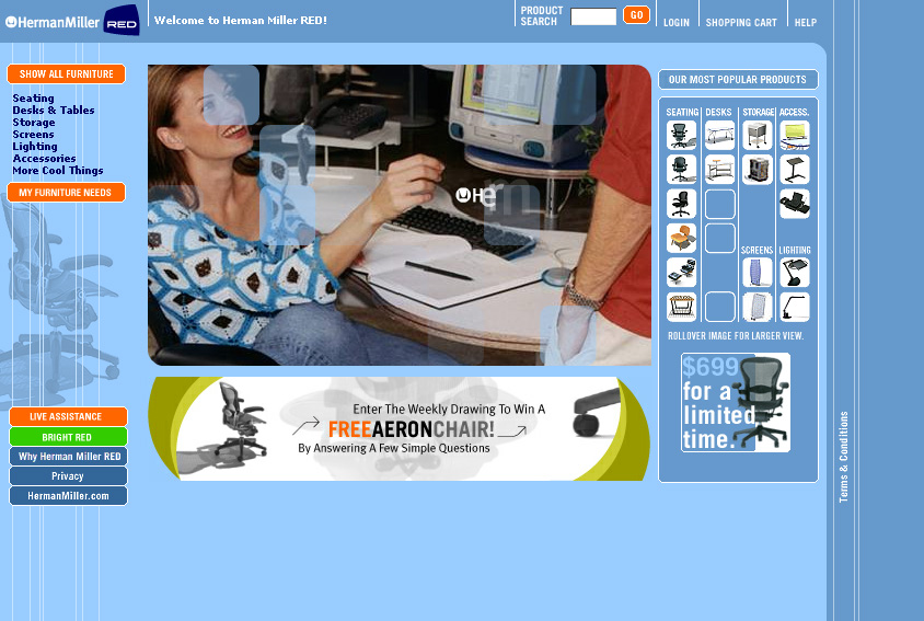
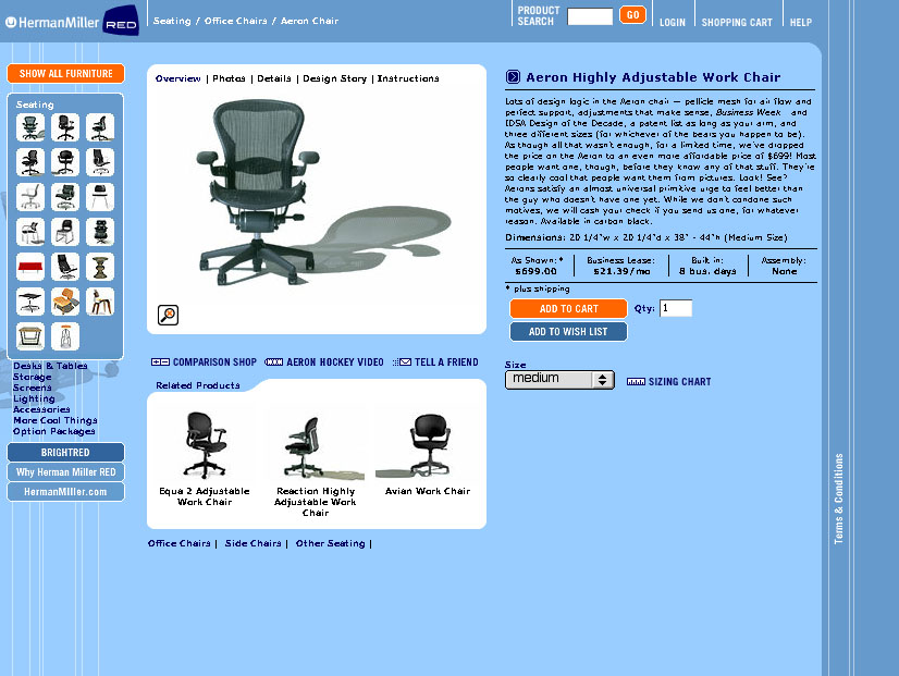
The important features of this website were to make the process of selecting and buying furniture easy and interesting. There are several ways of viewing the furniture, including a matrix page that shows all of the products organized by line and category and, roughly, by price. By seeing all of the offerings at once, customers quickly became acquainted with the breadth of the company’s products as well as which ones (and how many) might appeal to them. There were categorical views as well as collections by product line family. I developed a Needs-based furniture selector (shown below in annotated prototype form) so that people would have the ability to find furniture by their needs instead of having to research each product line and piece individually. This allowed them to more quickly determine which products can solve their problems.
I worked with a new division of Herman Miller, called RED, to design a commerce system online for their products. I worked mostly on strategy and information design as they had an awesome development team and company. I did some other odd projects for them, too (like their assembly instructions).
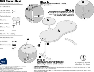
Believe it or not, this was one of the most interesting components of my work with Herman Miller Red. The original instructions took over 12 pages of paper for all 4 products in this one product line alone. They also weren’t the easiest to understand, either verbally or visually. The new instructions used simple shading and consistent views to step people through the instructions in one sheet for each product (2 sides in the case of the more complicated products). The instructions included a lot of new information as well, such as assembly time and cleaning instructions. The new files were delivered as both PDFs that are posted on the website as well paper, shipping in the boxes with the furniture.
Recent Comments