
In 1997, NIKE decided to build a true, permanent presence on the Internet that served their customers and enhanced their brand. Before this, they only dabbled in Internet technology without any clear focus of how it evolved their brand or what goals they might achieve. This site was purely a marketing vehicle and was never intended to be a place of commerce. NIKE viewed its site soley as a place to enhance, evolve, and express its brand.
NIKE valued the ability to create community based on sports interests and tell its unique product development stories. I led a team at vivid studios which created a strong, new strategy for Nike online that not only advanced these goals but helped to rebrand NIKE’s image from a ubiquitous, monolithic multinational to a more personal and local company that its audience (customers) could relate to. We did this by convincing NIKE that the Internet’s strengths were not in whizzy technological tricks, but in connecting people and giving them a voice. Essentially, the strategy was to make the company “little nike” instead of “big NIKE.”
One of NIKE’s biggest problems at the time was the ubiquity of their brand and the many bad attributes associated with it at the time (questionable labor practices in developing countries, globalization, monolithic decision-making, etc.). Our approach went back to NIKE’s original brand and corporate goals (before they grew so big) and aligned these to the Internet’s own brand strengths at the time to create the “little nike” concept. We accepted that NIKE must communicate differently and appropriately in each medium to use it effectively. While NIKE continued to be big, loud, and fast in its television and outdoor advertising, it could not deliver the same kind of emotion online with fast 15-second bursts of information. Instead, it would have to be emotional about sports by delivering more information and making its customers feel apart of the site and company.
vivid competed against 8 much bigger firms in winning the NIKE account. Key components of the strategy and its implementation focused in these five areas:
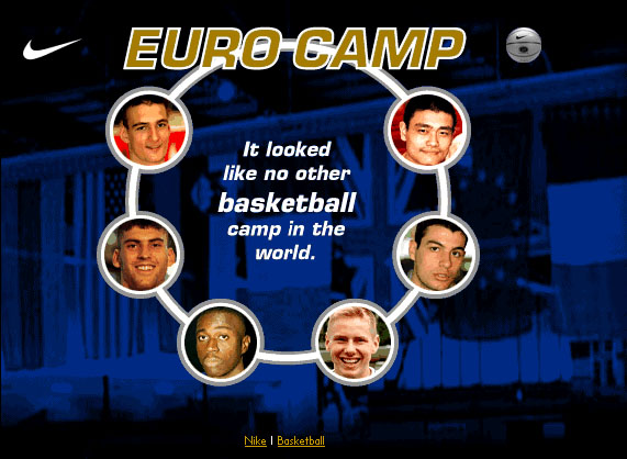
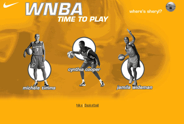
The creation of distinct sports-centric areas on their site (each with distinct visual design directions). These would serve as portholes into Nike’s activities in each sport as well as a place to find the kind of special information that only NIKE could provide.
The creation of interactive product development stories that helped athletes understand the technology and design choices made in the design and production of shoes, apparel, and equipment.
The creation of a publishing engine for creating and managing feature stories on the site.
The creation of several tools for building an online community for athletes around the world. These tools included databases of user-generated content for entering personal information (trading cards), location information (where to play around the world), and personal local events.
A clear strategy for developing areas of the site for non-sport information, including a NIKE Lab for ongoing, semi-permanent technological and research information, and info.nike.com for corporate information such as job listings, financial information, and community service programs.
Some of the features of this strategy included:
· storytelling engines for kids to share their experiences on the website
· diagrams and explanations of Nike’s technology and shoe construction and inspiration
· articles that put kids and amateur athletes on the same level as professional athletes
The strategy developed covered NIKE’s needs for the near future, including the possibility of creating and managing celebrity athlete sites (such as for Michael Jordan).
NIKE homepage: built for flexibility and rapid change
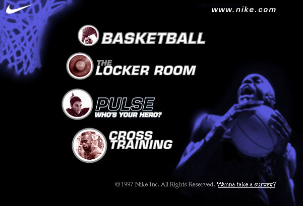
NIKE Basketball: bold colors, active background photography, ravy graphics, and a focus on individual style and play defined this sport section. It included articles, profiles, and “shoe stories” describing how and why their top products were designed.


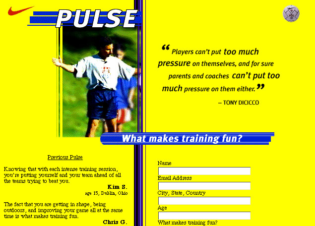
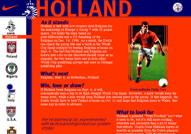
NIKE Futbol (Soccer): each section had a personality developed that reflected that sport’s community. Futbol had more team-oriented colors and stripes, brighter colors, and photography that exposed the environment. The Pulse feature (below) was the most popular and successful innovation on the site. It allowed NIKE to learn what people thought and give them a public voice, without turning-over all control over to each Web surfer.


Participants:
Strategy Development:
Nathan Shedroff: Creative Direction, Design
Doris Mitch: Creative Direction, Design (Doris and Clancy Ltd.)
Clancy Nolan: Creative Direction, Design (Doris and Clancy Ltd.)
Lisa Bertelsen: Project Management
Maurice Tani: Design and Production
Design and Implementation:
Nathan Shedroff: Creative Direction, Design
Doris Mitch: Creative Direction, Design (Doris and Clancy Ltd.)
Clancy Nolan: Creative Direction, Design (Doris and Clancy Ltd.)
Lisa Bertelsen: Project Management
Ken Fromm: Project Management
Derek Powazek: Design and Production
Max Carmichael: Design and Production
Stuart Rogers: Production
Travis Curl: Production
Nat Johnson: Engineering
Christian Mogenson: Engineering
Dan Jones: Engineering
Kevin John Black: Engineering
Sean Moody: Testing
Recent Comments