
I was the creative director for this nutriceutical company. I wasresponsible for all of the print materials (posters, catalogs, forms, etc.) as well as the packaging, identity, and all aspects except for the design of their website.
2000-2004
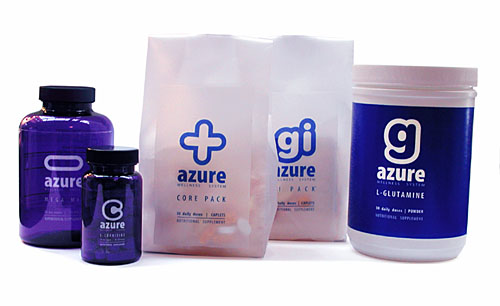
This nutritional supplement packaging was designed with the following goals:
- To make the packaging as inexpensive as possible since the user group is very price-conscious as most are on medical disability and have no regular income.
- Despite the low cost of the packaging, it needs to exhibit a validating sense of quality and potency.
Our market research showed the concerns of our audience:
- Our customers didn’t want the impression that the packaging was elaborate or costly.
- They also didn’t respond well to packaging that seemed folksy, organic, or nature-oriented.
- Our customers were tired of their medicines and didn’t want their nutritional supplements to remind them of more medicine.
Our solution included the following elements:
- Because the products are ordered online and over the phone and are never sold in a retail setting, we chose bags instead of boxes for the products with individual packs (to accommodate daily amounts with different pills). These bags were much less expensive and much less wasteful than traditional boxes as well as easier and faster to affix labels (directly printing labeling on the bags and bottles will be implemented when the company’s sales warrant the investment).
- Large, simple letters serve as identifying logos that distinguish each product in the system while forming a family of signifiers. These letters appear on all product literature as well as the side of the bags, allowing customers to identify different products from the side on a shelf.
- The bags reduced overall weight and served as it’s own packing material for transport in a close-fitting, standard shipping box through the mail, further reducing waste and cost.
- For products without pill packs (loose pills) are delivered in tinted transluscent bottles that have a high-UV protection rating (about 80%of standard white, opaque bottles) but look substantially different than medicine and help alert people to when they are running low on supplements.
- Products that come in powder form come with a scoop that is the precise daily dose for customers.
- While the company’s sales are still too small to warrant custom pill dyes, we chose among the possible, existing dyes to find the one that would work best with our customers. In particular, our research showed that fewer, larger pills (though not too large) were easier to swallow than many small pills. This is a particular problem in this market since people typically take 50-100 pills every day already. The pill shape chosen was a wide, smooth lozenge with a thinner-than-standard thickness.
- For these reasons, the packaging solution extended to the pill formulas as well. All extenders, fillers, an unnecessary binding ingredients were deleted to make the pills as small and as few as possible. This allowed us to bring the pill count down, in one case from 41 pills to 7, despite a nutritional formula that specified a much higher level of nutrients than a common multivitamin. This not only decreases the size of the packaging needed (packs, bottles, bags, etc.) but, more importantly, the number of pills our customers need to take.
- In some cases (such as the Core Pack product), the ingredients were divided to allow customers to delete key ingredients (in this case, Vitamin E) that might interact negatively with their medicines.
Recent Comments