From 1994:
One of the most important skills for almost everyone to have in the next decade and beyond will be those that allow us to create valuable, compelling, and empowering information and experiences for others. To do this, we must learn existing ways of organizing and presenting data and information and develop new ones. Whether our communication tools are traditional print products, electronic products, broadcast programming, interactive experiences, or live performances makes little difference. Nor does it matter if we are employing physical or electronic devices or our own bodies and voices. The process of creating is roughly the same in any medium. The processes involved in solving problems, responding to audiences, and communicating to others are similar enough to consider them identical for the purposes of this paper. These issues apply across all types of media and experiences, because they directly address the phenomena of information overload, information anxiety, media literacy, media immersion, and technological overload–all which need better solutions. The intersection of these issues can be addressed by the process of Information Interaction Design. In other circles, it is called simply Information Design, Information Architecture, or Interaction Design, Instructional Design, or just plain Common Sense.
Many people create or engineer interactions, presentations, and experiences for others. Almost all interactions–whether part of a book, a directory, a catalog, a newspaper, or a television program–can be created or addressed by one process. This process can be used to produce every CD-ROM, kiosk, presentation, game, and online service. It can also be used for every dance, music, comedy, or theater performance. While the traditions and technologies may change with every discipline, the process does not.
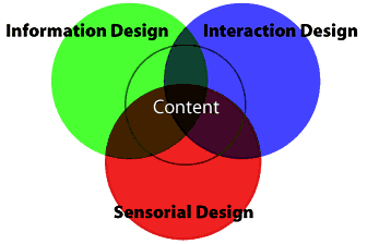
Information Interaction Design is the intersection of the disciplines of Information Design, Interaction Design, and Sensorial Design. Information Design’s roots are in publishing and graphic design, although few people in these industries intentionally practice them. Information Design addresses the organization and presentation of data: its transformation into valuable, meaningful information. While the creation of this information is something we all do to some extent, it has only recently been identified as a discipline with proven processes that can be employed or taught. Unfortunately, there are few resources for learning about the practices of Information or Interaction Design.
Interaction Design, which is essentially story-creating and telling, is at once both an ancient art and a new technology. Media have always effected the telling of stories and the creation of experiences, but currently new media offer capabilities and opportunities not yet addressed in the history of interaction and performance. In particular, the demands of interactivity are often misunderstood by all but the most experienced storytellers and performers. How these skills are expressed through interactive technologies and what demands and interests audiences will have for these remains to be understood. Consequently, there are also few sources of information about these issues and the techniques used to meet them. This is new territory that is desperate for some new ideas and cogent explanations. It is also the most critical component to the success of interactive products.
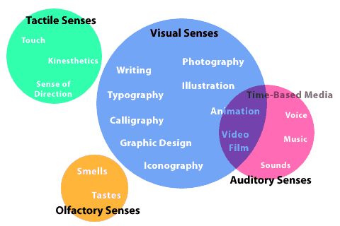
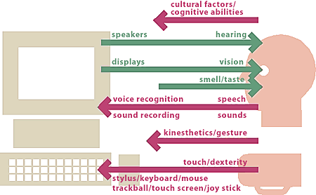
Sensorial Design is simply the employment of all techniques with which we communicate to others through our senses. After writing, visual design techniques in disciplines such as graphic design, videography, cinematography, typography, illustration, and photography are usually the first to be recognized and employed, but the disciplines that communicate through other senses are just as important. Sound design and engineering and musical and vocal performance are also useful in the appropriate circumstances. In fact, sometimes they are the only appropriate media for communicating a particular message. Tactile, olfactory, and kinesthetic senses are rarely employed (often due to technological or market constraints), but are just as valid and can add enriching detail to an experience.
The disciplines of sensorial media are worlds unto themselves, with their own histories, traditions, and concerns. To learn each well takes time and skill. Therefore, it is crucial to learn at least an overview of the important issues and techniques of each discipline so that they can be employed properly when presenting ideas and communicating messages–especially within a team. In each of these areas, experts should participate in employing the various media in support of a project’s information and interaction goals and messages.
These levels of understanding are significant because they define the boundaries with which we can create and communicate. While Information Design primarily focuses on the representation of data and its presentation, the emphasis in Interaction Design is on the creation of compelling experiences. When designing projects, I usually find it easier to start with the information design process if a substantial amount of data already exists and the interaction design process if it does not. The following sections describe the processes I have found useful for both.
Information Design
While few designers have been explicitly taught the issues paramount to clear communication (e.g., organization, presentation, goals and messages, clarity, and complexity), these functions at least have been addressed on a subconscious level by anyone who attempts to organize their thoughts and communicate them. Information Design doesn’t ignore aesthetic concerns but it doesn’t focus on them either. However, there is no reason why elegantly structured or well-architected data can’t also be beautiful. Information Design does not replace graphic design and other visual disciplines, but is the structure through which these capabilities are expressed.
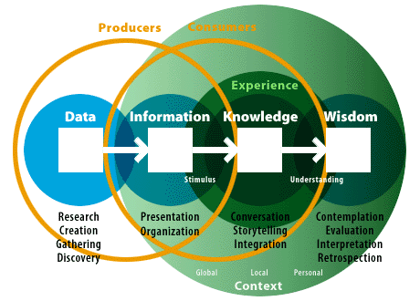
An understanding of Information Design starts with the essential view that the vast amount of things that bombard our senses everyday are not pieces of information but merely data. Richard Saul Wurman expresses this in his book, Information Anxiety. Data is fairly worthless to most of us; it is the product of research or creation (such as writing), but it is not an adequate product for communicating. To have informational value, it must be organized, transformed, and presented in a way that gives it meaning.
Note: Since 1994, I have learned that this spectrum was originally described by several people.
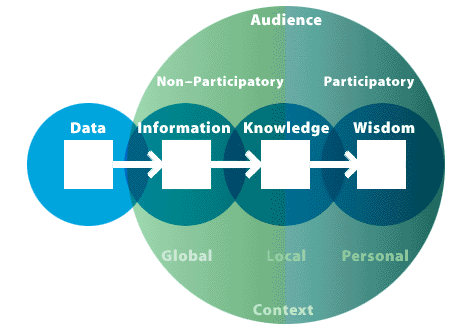
Information is also not the end of the continuum of understanding. Just as data can be transformed into meaningful information, so can information be transformed into knowledge and, further, into wisdom. Knowledge is a phenomenon that we can build for others just as we can build information for others from data. This is done through Interaction Design and the creation of experiences. Think for a moment how difficult it is to build a meaningful experience for others. It is first necessary to understand your audience; what their needs, abilities, interests, and expectations are; and how to reach them. Brenda Laurel often states that interactive media “is not about information, it is about experience.” She is absolutely correct but, in creating these experiences for others (and even for ourselves to some degree), we must understand and properly structure the information and data with which we use to build experiences.
The Continuum of Understanding
A Bit About Data
Data is the product of discovery, research, gathering, and creation. It is the raw material we find or create that we use to build our communications. Unfortunately, most of what we experience is merely data. It is fairly easy to distinguish as often it is boring, incomplete, or inconsequential. Data isn’t valuable as communication because it isn’t a complete message. Most of the technology we call “Information Technology” is, in fact, only data technology because understanding and communication of information is not addressed. These technologies are primarily concerned with storage, processing, and transmission. Data is useful only to producers or anyone playing a role in production. Data is not meant for “consumers” and too often we deluge our audience with data instead of information, leaving them to sort it out and make sense of it. Many providers even boast of the large amount of meaningless, contextless data they throw at their customers. CNN, for example, actually calls their data bits “factoids” and interjects them between otherwise meaningful presentations.
Successful communications do not present data. If, for example, presenters haven’t bothered to provide context and build meaning, audiences have little patience for doing it themselves. As designers, we constantly must ask ourselves what service we provide.
More About Information
Information makes data meaningful for audiences because it requires the creation of relationships and patterns between data. Transforming data into information is accomplished by organizing it into a meaningful form, presenting it in meaningful and appropriate ways, and communicating the context around it. These processes are described in more detail below.
The Experience of Knowledge
With every experience, we acquire knowledge; it is the understanding gained through experiences—good or bad. Knowledge is communicated by building compelling interactions with others or with tools so that the patterns and meanings in their information can be learned by others.
There are many types of experiences that confer different types of knowledge. Some knowledge is personal, having meaning unique to one person’s experiences, thoughts, or point of view. Local knowledge is knowledge shared by a few people because of their shared experiences. Global knowledge is more general, limited, and process-based, since it relies on such heavy levels of shared understandings and agreements about communication. Effective communication must take into account the audience’s level of knowledge. This makes it more difficult to communicate to larger audiences because the pool of shared knowledge is less detailed and more generalized. Knowledge is gained through a process of integration, both in the presentation and in the mind of the participant. Information forms the stimulus of an experience while wisdom can be the understanding of the message gained through the experience. Knowledge is a fundamentally participatory level of communication and we should always make it our goal because it allows the most valuable messages to be conveyed.
What is Wisdom?
Wisdom is the most vague and intimate level of understanding. It is much more abstract and philosophical than other levels and less is known about how to create or effect it. Wisdom is a kind of “meta-knowledge” of processes and relationships gained through experiences. It is the result of contemplation, evaluation, retrospection, and interpretation–all of which are particularly personal processes. We cannot create wisdom like we can data and information, and we cannot share it with others like we can with knowledge. We can only create experiences that offer opportunities and describe processes. Ultimately, it is an understanding that must be gained by one’s self.
Organizing Things
The first step in transforming data into information is to explore its organization. This simple yet crucial process can appear futile, but often you can discover something through it that you had never seen before. It is important to realize that the very organization of things affects the way we interpret and understand their separate pieces. Take any set of things: students in a classroom, financials for a company, information about a city, or animals in a zoo. How would you organize these? Which is best? Richard Saul Wurman suggests five ways to organize everything, but seven seems clearer to me. Literally everything can be organized by alphabet, location, time, continuum, number, or category. Additionally, things often can be randomly organized (in other words, by not organizing them).
Often, there are often better ways to organize data than the traditional ones that first occur to us. Each organization of the same set of data expresses different attributes and messages. It is important to experiment, reflect, and choose which organization best communicates our messages. It is also important to note that these seven ways of organizing make it easy to brainstorm, but it is up to us to choose the most appropriate way to present data to our audiences. Some of the more important ways of organizing are presented below.
Alphabets
Most books have alphabetical indexes because, while we may know exactly what we are looking for, we often do not know where to find it. Though the alphabet is an arbitrary sequence of symbols, indexes work well because we have been taught alphabetical sequence from an early age. It is not universally useful, as you will find if you ever try to use a phone directory in a language that uses a different alphabet than your own. Many indexes are organized alphabetically, but few products are (primarily dictionaries, encyclopedias, and other reference works). This is because few data have any great meaning based on the first letter of their labels. The alphabet actually is a continuum (from A to Z) but it is a special one for the reasons stated above.
Locations
Locations are natural ways of organizing data with important relationships with or connections to other data. How easy would it be to find the exits to an airplane if they were listed and described in text with no diagram? Many projects can benefit by locational organizations but seldom are, simply because their designers never experimented with the idea. Producing maps and diagrams is not as easy as writing text, but if you have ever used an atlas or ACCESS travel guide, you know how much better a sense of a place can be achieved when things are oriented by geographical relationships. Consider a subway map that simply lists all station stops in sequence versus one that arranges them in a representation of the city they serve. This may sound obvious (and it should be), but why do not car manuals organize parts by their location in the car, or medical books by location in the body (the one thing you are sure of when you know you aren’t feeling well)?
Time
Organizing things by time or sequence may sound obvious for bus and train schedules or historic timelines but it can be just as effective for instructions such as cooking, driving, or building. Time need not be addressed only in minutes and hours but also in days, months, years, centuries, processes, or milestones.
Continuums
Any qualitative comparison can be described with a continuum. All ratings systems, whether numbers of stars or the number of RBIs of a professional baseball player, indicate a value scale. Arranging items in a continuum indicates that this value scale is the most important aspect of the data. As with any organization of data, the primary organization expresses a different message and importance than other organizations.
Numbers
I categorize number systems as a separate way of arranging things. Much like alphabets, numbers are merely an arbitrary continuum (usually Base-10, since our species has ten fingers). But unlike alphabets, Base-10 numbers are much more universal because they combine in different forms due to mathematical relationships. It is common but not necessary for number organizations to be continuums. For example, the Dewey Decimal System, used for organizing books in many libraries, is not a continuum because it is a number system that does not represent any magnitude or attribute; it simply assigns numbers to categories and sub-categories.
Categories
Categories are a common organization and a reliable one, since they allow similar things to be grouped together by attributes that are considered important in some way. Defining the specific categories is crucial, as they will communicate the designer’s prejudices and understandings more easily than any other organization. As with all organizations, these control the perceptions of the information.
Randomness
While random or arbitrary organizations might not seem a useful way to organize things and “add value” to them, it is sometimes the best way if a challenge of some kind is involved. Consider a game where all of the pieces are arranged already or one where its sequence is already determined and carefully, logically laid out. Such a game would not be very fun to play. There may be other times where random organizations present a better experience than an orderly one and it is up to the designer to explore these possibilities and employ good judgment.
Advanced Organizations
In case these descriptions seem too dry and utilitarian, let me describe an example where the organization of data can provide an intense emotional reaction. If you are familiar with the Vietnam War Memorial in Washington, DC, you may already know how quiet yet moving this monument is. What you may not realize is the importance of the monument’s organization. The names of all of the US military personnel who died in the Vietnam war are inscribed on the surfaces of two long, black granite walls. The walls start out short (around twelve inches) and grow to more than nine feet in the center where the two meet. They are constructed this way for a special reason. All of the names are arranged by time (date of death), from the first who died during the “police action,” to the mounting death toll at the height of the war, trickling off as the US pulled out of the area. The names thus chart the pattern of US involvement in Vietnam and the personal stories of the real people involved and most affected. Imagine how different the monument would be without this organization. Suppose the names were organized by alphabet (which was actually proposed once the design was accepted). While it might be easier to find a particular person, the search and the names themselves would be reduced to a mechanical list, a granite White Pages. Lost would be the individuality of each name and life. In a list of seventeen John Smiths, which one is yours?
An alphabetical organization would have completely depersonalized the monument and devastated its emotional power, so would most other organizations. Imagine if the names were organized by category (e.g., pilots listed here, infantry listed there) or on a continuum based on rank or, for that matter, height (e.g., the tallest men at one end, the shortest at another). What is key to this emotional experience is that those who died are found among those whom they died with. Without this organization, in fact, there is no longer meaning to the wall growing and tapering down in height. Any other organization would have created a different memorial entirely and, most likely, one without the power and emotion created in the existing one. All of this is somewhat subliminal. When you visit the monument, its information structure isn’t the first thing you perceive, but it works nonetheless. This is true of any project, whether it is a sensitive and emotional monument, a powerful and inspiring museum, a useful and concise catalog, or a thrilling and interesting performance.
Multiple Organizations
Almost all organizations are actually nested, multiple organizations. Most directories, for example, might list names by division or location, then by department or title, then by alphabet. Catalogs may break products into categories first, then arrange them in a continuum based on price (such as highest cost to lowest). Be aware that a primary organization is not necessarily the only organization and it allows for secondary or more sub-organizations when working with larger groups of things. Of course, each of these needs to be clear and meaningful as well.
It is also useful to include indexes that organize the same items in different ways. This is important for enabling people to find things in ways that are most appropriate for the things they know or the ways they learn. All people learn differently and have varying skills. Some may be comfortable with maps while others prefer lists. Some may not understand an alphabetical listing while others can’t relate to a continuum. Multiple organizations help everyone find things easier. In addition, even if people understand the organization, they may not have the correct information. For example, they may know the street they need to go to, but not where to find it on a map (this is where street indexes come in handy). They may know that they want a recipe for a low-calorie dessert, but don’t want to search through every recipe in their cookbooks to find one.
It is precisely the ability to see the same set of things in different organizations that allows people to uncover the patterns in the relationships between these things. Ideally, people should be able to rearrange the organizations themselves or be provided with different arrangements so they can begin to understand these patterns for themselves.
Metaphors
Much has been made of the ability of metaphors to help people quickly understand things. While metaphors are generally helpful, they are a false crutch to cling to. Metaphors are not required nor are they always the best approach. Too many interactive projects, for example, start with the question “what metaphor should the interface use?” Most often, the “interface” shouldn’t use any narrowly outlined metaphor.
Metaphors are simply one way of setting context (i.e., transforming data into information). It is important that the context implied is the one intended and that it matches the desired understandings. Too often, metaphors set the wrong context and help create expectations that are not accurate and which cannot be met.
Metaphors are especially useful when they relate well to a user’s or reader’s experience. However, to be used well they must be abandoned when they begin to fail or when they are asked to do more than the limits of their capabilities. A good example is the desktop metaphor used by many personal computers. The strength of this idea is that it uses familiar objects to indicate relationships by analogy (e.g., a trash can for discarding files or folders for keeping groups of files and other folders together). Fortunately the designers ignored the metaphor when it broke down (e.g., dialog boxes) and didn’t try to take it further than was appropriate.
Recently, a colleague suggested that metaphors could be another way of organizing data. She may be correct, and more thought should be devoted to this question, but I believe it is more accurate to say that metaphors are a means of representing things than a way to organize or present them. For me, metaphors only achieve a cognitive orientation of meaning rather than one of structure.
Goals and Messages
All effective communications involve defining the goals of the experience and the messages to be communicated as early in the development process as possible. These definitions drive all decisions, from Information Design, through Interaction Design, and including all aspects of Sensorial Design. Every decision, no matter how simple or mundane, should support the defined goals and messages. This ensures that inappropriate data, techniques, technology, or styles are not used. For every decision, the solution should be one that best meets the goals and messages defined at the beginning of the project. While it sounds obvious, too often the ideas that drive the presentation are at odds with the messages presented.
Many times, the goals and messages stipulated by a client will not be correct. Clients are usually too close to their problems to see solutions clearly enough. It is important to uncover one or two layers of goals behind those stated and agree to these if you want to be successful. Otherwise, you may find yourself unable to satisfy a client or communicate the correct messages to your audience.
Clarity
The most important goal of effective communication is clarity. Clarity is not the same as simplicity. Richard Saul Wurman taught me this well. Simple things are clear if the message is intended to be brief and small, but often the message is about a complex relationship that can only be presented with a necessarily large amount of data. This complexity can be made clear through effective organization and presentation and need not be reduced to meaningless, “bite-sized” chunks of data. Clarity includes the focus on one particular message or goal at a time, rather than an attempt to accomplish too much at once. Simplicity is often responsible for the “dumbing” of information rather than the illumination of it.
Interaction Design
Think about what experiences are. How do you create them? How do you know when they are successful? What are the most satisfying experiences you can remember? Unfortunately, few people are ever taught how to create wonderful experiences for others. I believe that one of the nicest experiences you can have is to enjoy a stimulating conversation with another person over great meal. I would rather do this than watch television, read a book, or use any interactive product I have ever seen. But how do you set up and maintain such an experience? We are taught history, science, mathematics, language, and many valuable processes, but hardly anything about having a great conversation, though this is one of the most satisfying things you can enjoy. Why?
While some people seem to have natural abilities for creating wonderful experiences for others (such as the “life of the party” or a great instructor), most of us must learn the hard way: through trial and error. Wouldn’t it be great if we could be taught explicitly how to create meaningful interactions for each other? This is what Interaction Design addresses and, unfortunately, it is a new field with few texts, few classes, and almost no curriculum (even less than Information Design). The best sources for learning these skills–and these are critical to the success of any interactive project or presentation–are the performing arts. Indeed, the most prominent new media Interaction Designers all seem to have backgrounds in some type of performance, whether it is dance, theater, singing, storytelling, or improvisation. Because of the history of interaction in performing arts, some of the only sources for guidance come from the fields of script-writing, storytelling, performance, and instructional design. Each of these disciplines is particularly concerned with the communication of varied stories and messages through the creation of interesting and wonderful experiences. We can look to these disciplines for knowledge about interactivity, but we must remember to pay attention to the limitations of the technologies and media through which our messages are conveyed.
Continuums of Interactivity
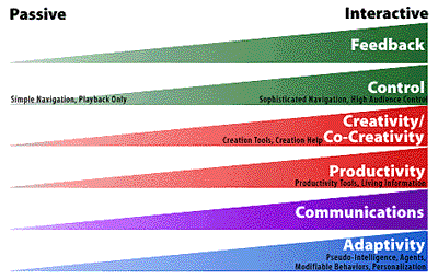
One way to consider the meaning of interactivity is to envision all experiences (and products) as inhabiting a continuum of interactivity. On one side are passive experiences like reading a typical book or watching television. While some have argued that even in these events there is an interaction between the mind and the device or the imagination and the story, these are somewhat esoteric and philosophical notions. In comparison, these activities don’t exhibit the kinds of choice, control, productivity, or creativity of experiences like painting, conversing, or producing a television program. The difference that defines interactivity can include the amount of control the audience has over the tools, pace, or content; the amount of choice this control offers; and the ability to use the tool or content to be productive or to create.
Therefore, all products and experiences can be placed along this continuum. It is important to note that there is no good or bad side of this continuum. The only judgment should be if the level of interactivity or place along the continuum is appropriate to the goals of the experience or the messages to be communicated.
Interactivity is different from production value or “richness.” Typical television programs and films can have incredibly rich stories, techniques, and presentations, but offer almost no interaction except turning the channel or leaving the theater. Compare this with the experience of improvisational comedy in which a story is created as the audience watches, gets involved by offering suggestions, or even joins in the action.
Control and Feedback
The first two spectrums of interactivity focus on how much control the audience has over the outcome or the rate, sequence, or type of action, and how much feedback exists in the interface. Typically, experiences with high interactivity offer high levels of feedback and, at least, some control. Examples of these kinds of experiences are games in which the game play depends directly on the player’s involvement and choices, unlike television in which the experience continues whether anyone is viewing or not.
Productivity and Creative Experiences
Productivity is another spectrum that can coincide with other interactivity spectrums. Creative experiences allow a user, creator, or participant to make, do, or share something themselves. Some experiences can be used more productively than others (such as entertainment), and productivity is traditionally of more concern in business products than entertainment products–but being creative and producing something are typically more interesting, entertaining, and fulfilling activities. Creation tools are important components for creating meaningful, compelling, and useful experiences. Creative products and experiences require that others participate by creating or manipulating instead of merely watching and consuming.
Co-creative (a term coined by Abbe Don) technologies are those that offer assistance in the creation process. People are naturally creative and are almost always more interested in experiences that allow them to create instead of merely participate. While many situations can create anxiety if people are not accustomed to performing with the tools or techniques, if this anxiety can be lessened (either through the careful design of the experience or offered assistance), people express their creativity. This can take the form of recommendations, guidelines, advice, or actually performing operations for users.
Another attribute of these experiences is the capability of adding content or tools to a predefined set, resulting in a “living” product, toolset, or database. Few products are designed to grow or become more valuable over time with participation from the audience. Yet, products that help users structure their experiences and share their knowledge are inherently more valuable than those which do not.
Communicative Experiences
Like productive and creative experiences, opportunities to meet others, talk with them, and share their personal stories and opinions, are always viewed as valuable and interesting. Because these experiences involve two or more people, they also inherently involve high levels of control, feedback, and adaptivity. The telephone is an excellent example of a communicative experience, as are chat lines, discussion boards, and cocktail parties. Some of these are so valuable and enjoyable for some people, that they have become virtually indispensable.
Adaptive Experiences
Adaptive technologies are those that change the experience based on the behavior of the user, reader, consumer, or actor. These can include “agents,” modifying behaviors, “pseudo-intelligence.” Agents are processes that can be set to run autonomously, performing specific, unsupervised (or lightly supervised) activities and reporting back when finished. Modifying behaviors are those that change the tools and/or content involved based on the actions of techniques of the user. Some games, for example, do this, becoming more difficult as the player becomes more proficient. Other possibilities include content changing to reflect point of view, level of proficiency required, or amount of detail desired. Both of these techniques might have the effect of making a device or person in an experience appear intelligent, as might other techniques. However, this calls into question a much larger discussion of intelligence, life, and how these are defined. Suffice it to say that certain kinds of choices in changing behavior based on the actions of others (whether random, instinctive, or algorithmic) can create the appearance of a more sophisticated system or process and imply a kind of intelligence.
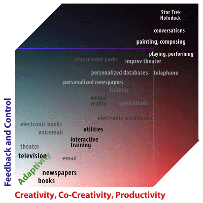
The Experience Cube
Each of these six spectra can be plotted on a diagram in order to place typical interfaces and products and reveal their relationships to each other by these attributes. Unfortunately, it is difficult to create a six-sided diagram that is clear. However, a close approximation can be created by combining the Feedback and Control attributes into one dimension; the Creative, Productive, and Communicative attributes into another; and the Adaptive attributes into a third. This gives us a rough Experience Cube and shows us some general relationships between experiences that we can learn from.
All experiences, whether mediated by technology or not, fit into this cube. This is important because it reminds us that the experiences we create in our products are viewed in a much wider context by our audiences. Unfortunately, most producers of interactive media or multimedia don’t realize this. It must be remembered that a reader, user, or consumer has access to many experiences and, most likely, is not as enamored with the technology of any one medium as the developer might be. This means that the competition for interactive media products is as big as all of human experience. In other words, competitors for a CD-ROM on tropical fish are not other tropical fish CD-ROMs or even laser discs, but television documentaries, narrative and reference books, aquariums, scuba diving, travel, etc. If the experience you create is not a compelling one (whether it is justified by the bounds of the technology or not), you will never find a large audience. This is probably why we have seen only a few categories of successful interactive media products: children’s books and lessons, games, reference works, and pornography. Both games and reference works use interactive media appropriately and create experiences that cannot be duplicated easily in other media. While some children’s books and products do this, even the ones that don’t have been successful, probably because the market (parents) can justify the expense on their children’s education. Curiously, pornography uses interactive technologies particularly poorly, but it seems there is an overlap of sexual curiosity with technology.
So, we come back to the question: how does one create meaningful experiences and interactions? We must first revisit our goals and messages and reevaluate the kinds of experiences we want our audience to have. We must also ask them what their needs and wants are with regard to these experiences. This is what market research attempts to accomplish. It is not user testing (which needs to be done later once some possibilities have been developed), but a crucial inquiry. The process must involve brainstorming alternatives that meet these goals, messages, and audience interests and abilities until possible solutions emerge. These must then be given shape with the tools of Sensorial Design and tested before they are approved or labeled successful.
Sensorial Design
Sensorial design is simply an all-encompassing category over those disciplines involved with the creation and presentation of media. Among other disciplines, these include writing, graphic design, iconography, map making, calligraphy, typography, illustration, and color theory (graphics); photography, animation, and cinematography (images); and sound design, singing, and music. Actually, perfumery and cooking should be considered in this category since these involve the purposeful stimulation of the senses–even if these senses aren’t as widely addressed. Each of these disciplines has deep traditions and detailed procedures. It is not appropriate to focus on them here, but while they are all different in many ways, they all share some common attributes and concerns. These include the appropriate use of media, style, technique, media literacy, and bandwidth applicable to the technology of the situation, as well as an understanding of the human senses.
Media Differences
Each medium has different strengths and weaknesses. Each excels in different capabilities and different types of communication. These are intricately woven into the way we perceive through our senses. Think about our senses and how we use them. We sorely need to develop a better understanding of our five senses, how they operate, how they relate to each other, and how to create for them. Diane Ackerman’s book, A Natural History of the Senses, offers an inspiring discussion on our sensorial experiences. This is but a beginning toward a better understanding that we may then use to create more compelling experiences.
Style and Meaning
Using these media appropriately is not always easy. Many times, different parties involved demand the use of one component when another might be better. The same is true of style. All style has meaning, whether it is implied, accidental, or deliberate. Choosing the appropriate attributes and implementing them consistently is imperative to the development of a cohesive experience. For large projects, this cohesion can easily get lost as many people implement various parts to their own standards. There are few details that do not affect the presentation, legibility, and understanding of the meaning of a message. Even a detail like justified type (flush left, flush right, or centered) changes the legibility and perception of a paragraph and, therefore, the text itself. All sensorial details must coordinate not only with each other, but with the goals and messages of the project. A more integrated and careful synthesis of these processes will result in a more compelling, engaging, and appropriate experience, as well as a more successful the communication and interaction.
Conclusion?
An interface to any experience, whether technological, physical, or conceptual, must have a message and a reason for communicating it and begin with the creation of meaning and the development of appropriate types of interactivity. These decisions drive the use of sensorial media to present the experience to the audience in an appropriate and supportive way. Addressing one factor without the others can contribute to an experience that is incomplete or unbalanced. In many cases, simply understanding these concepts can lead to the development of better experiences, but it is usually necessary to address these attributes specifically in an explicit and procedural way.
This is really not a conclusion as much as it is a beginning. There is still much for all of us to learn and share about these issues. Both Information Design and Interaction Design are extremely new disciplines and they will grow considerably as we experiment and create. They are, however, the keys to a better understanding about communication and will serve us well over the next phase of our development.
Note: This paper is now a chapter in the book Information Design, edited by Bob Jacobson and published by MIT Press.
If you prefer Italian, Franco Giovannini, has posted an excellent translation.



Trackbacks/Pingbacks