
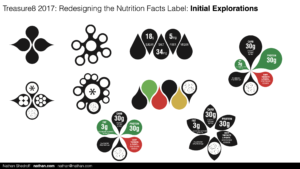
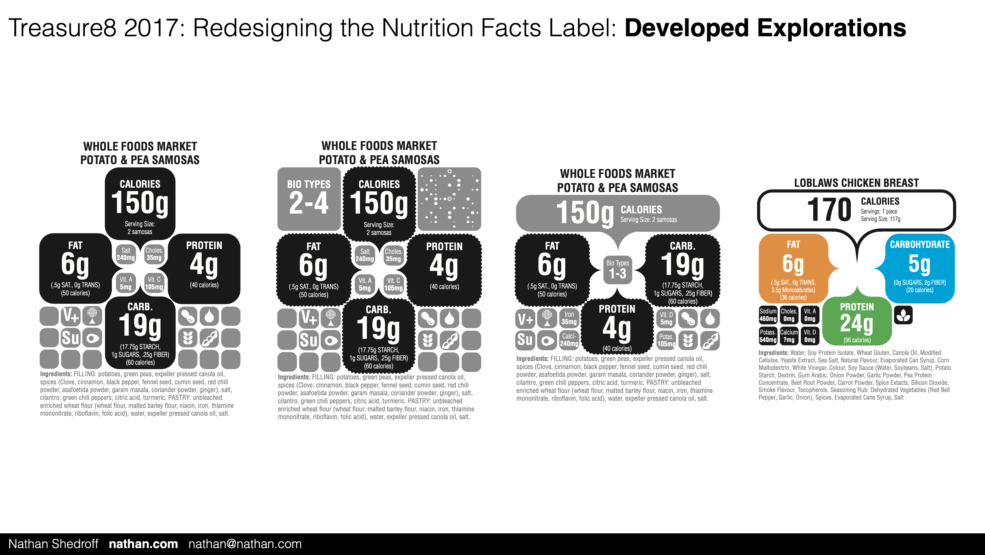
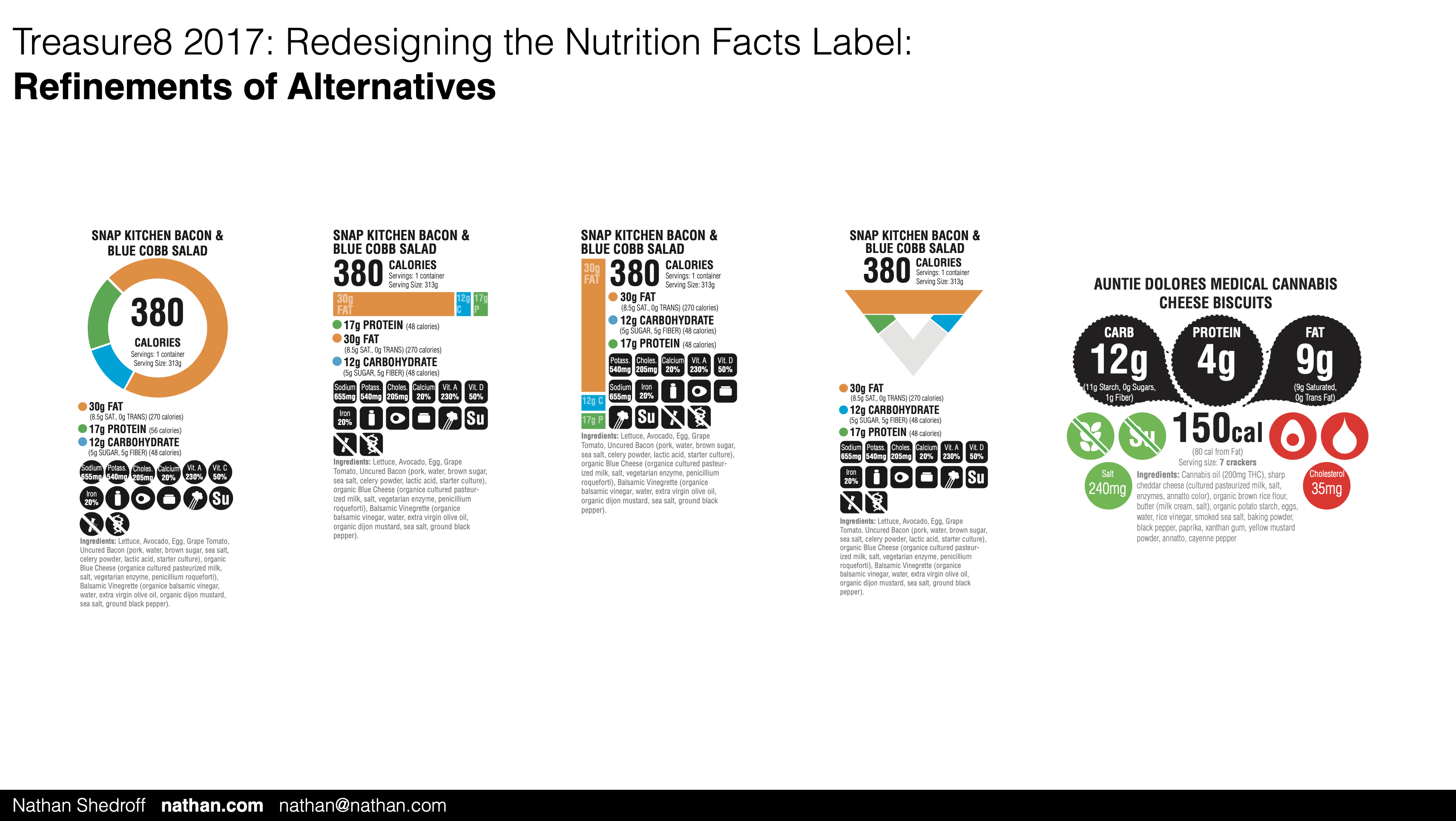
During much of 2017, I worked with Treasure8 in San Francisco on a new kind of Nutrition Facts label that would be easier to read for both people and machines. The purpose was to present clearer hierarchies of information, in context, and make it easier for people to make choices, be alerted to allergens, and integrate into their digital applications. These are all unfinished explorations, particularly the icons (which are meant only to be stand-ins). They reflect a LOT of explored options regarding different elements to highlight while balancing immediate readings with deeper data.
Many of the designs explore how to condense as much information into as small a format as possible and make it easy to compare nutrition across different product options. These are just a few of the many considered during the 6+ months of development. I’d love to finish these some day, with the right partner.


Recent Comments