ISBN: 0-553-35485-X (Macintosh)
ISBN: 0-679-75586-1 (Windows)
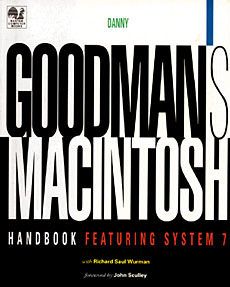
Danny Goodman’s Macintosh Handbook was designed to set a new standard for “how-to” computer reference books. It was designed not only to take advantage of a 4-color presentation and to introduce and support the Macintosh interface in its own design, but to make it easy for different kinds of readers with different experience levels find answers quickly and understand key relationships. It makes extensive use of tools that can help print books perform a bit as electronic products do and bridges the gap between these two media.
1993
Participants:
Danny Goodman: Writing
Richard Saul Wurman: Information and Visual Design
Nathan Shedroff: Information and Visual Design, Illustration, Production, Project Management
J. Sterling Hutto: Production
Scott Summers: Illustration
Kitti Homme: Production
Tom Beatty: Production
Michael Everitt: Production
Jane Rosch: Client Contact
The interaction design for this project was kept simple and relevant to giving presentations on the material. There is a navigation palette for quickly moving between topics and content. The icons at the top of the screen indicate the roles involved with the topic on the screen and jump to a description of the responsibilities for each role.
All of the text in this book is written to make sense as short paragraphs that explain procedures concisely and clearly. Readers can quickly get the answers they need without reading through paragraphs of unnecessary information. Also, there was a conscious decision to make sure that all topics fit on one page or one spread. This means that when a reader finds the right topic, the answer is in front of him or her somewhere and not pages away.
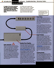
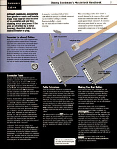
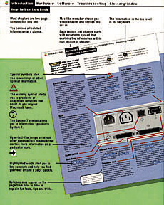
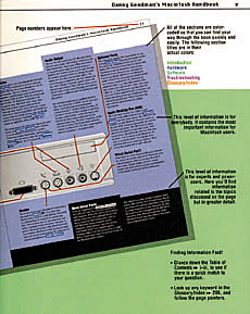
There are three layers of information for each topic. The text at the top of the page (against white) is introductory text. The middle band (against the colored background) is intermediate information, and the text reversed out of black at the bottom is for experts only. This allows readers to move through the book and easily find the information that pertains to their experience. It also allows readers to read more technical information only if they desire and at a pace that insures that they have gotten more basic, contextual information on a topic first.
There are several instances of what we affectionately called “balloon kibbitz.” These were the little side comments made my Danny that were of interest to Macintosh trivia buffs or shared part of his personal experience and personality. These were separated by little balloons following the Macintosh’s balloon help guidelines.
We paced some of the information by introducing chapter introduction spreads so readers can determine that they were in the right section before proceeding. This was done to help them find answers to specific questions faster but has little affect on browsing.
This book’s design made use of the Macintosh System 7 interface design guidelines whenever possible. This was done not only to distinguish the book’s visual appeal, but to reinforce the Macintosh’s interface familiarity by using the system interface for similar features and functions of the book. Therefore, the experience of navigating the book gives the reader experience with the Macintosh interface and makes it less intimidating and peculiar.
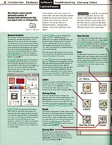
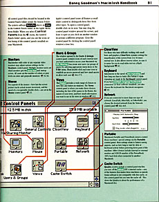
The menu at the top of the page gives an overview of the book’s structure at all times while the menu items indicate the particular topis at hand. The highlighting in the text indicates important concepts while the jump words indicate related information. The highlighted words and prases also function as “landing pads” for the jumps. The bold words and phrases indicate titles of software objects. Wherever possible, we used the typefaces of the system and keyboard to reinforce the difference between written text and referred-to items.
Diagrams and screenshots were used whenever possible to help explain the concepts and show procedures. In many places, these diagrams serve as visual maps of hardware and software objects.
Recent Comments